MULTNOMAH COUNTY LIBRARY

RENEW YOUR WONDER

MULTNOMAH COUNTY LIBRARY REBRANDING PROJECT

Multnomah County Library is the third busiest public library in North America. As Oregon’s largest public library, it serves nearly one-fifth of the state’s population. But it’s so much more than a room full of books. From storytime to computer classes and E-books to home delivery services, finding a job to getting a GED, all the way down to movies and streaming music. The Library is an ultimate educational resource. They needed a mark to reflect all of their services as well as the patron’s they serve. After all, no matter who you are – rich or poor, urban or suburban, founding father or aspiring citizen – the Library is your resource. So come on in, you are welcomed to renew your wonder.
CLIENT: Multnomah County Library
INDUSTRY: Education
SERVICES: Logo design, branding manual
DATES: 2015

LOGO

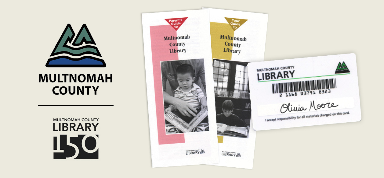
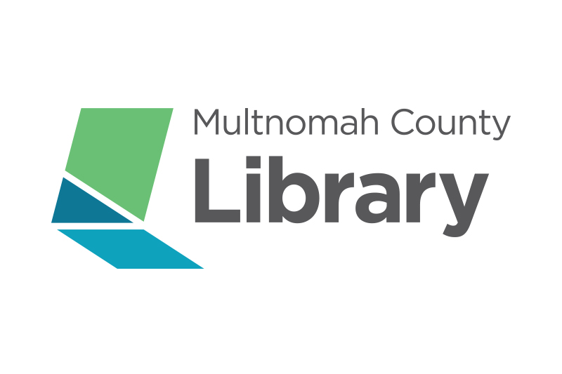
Since the 1990’s the Library utilized the Multnomah County logo. In more recent years, they used a 150-year badge. Now, well past the 150-year mark, they were in need of something unique and personal to them.

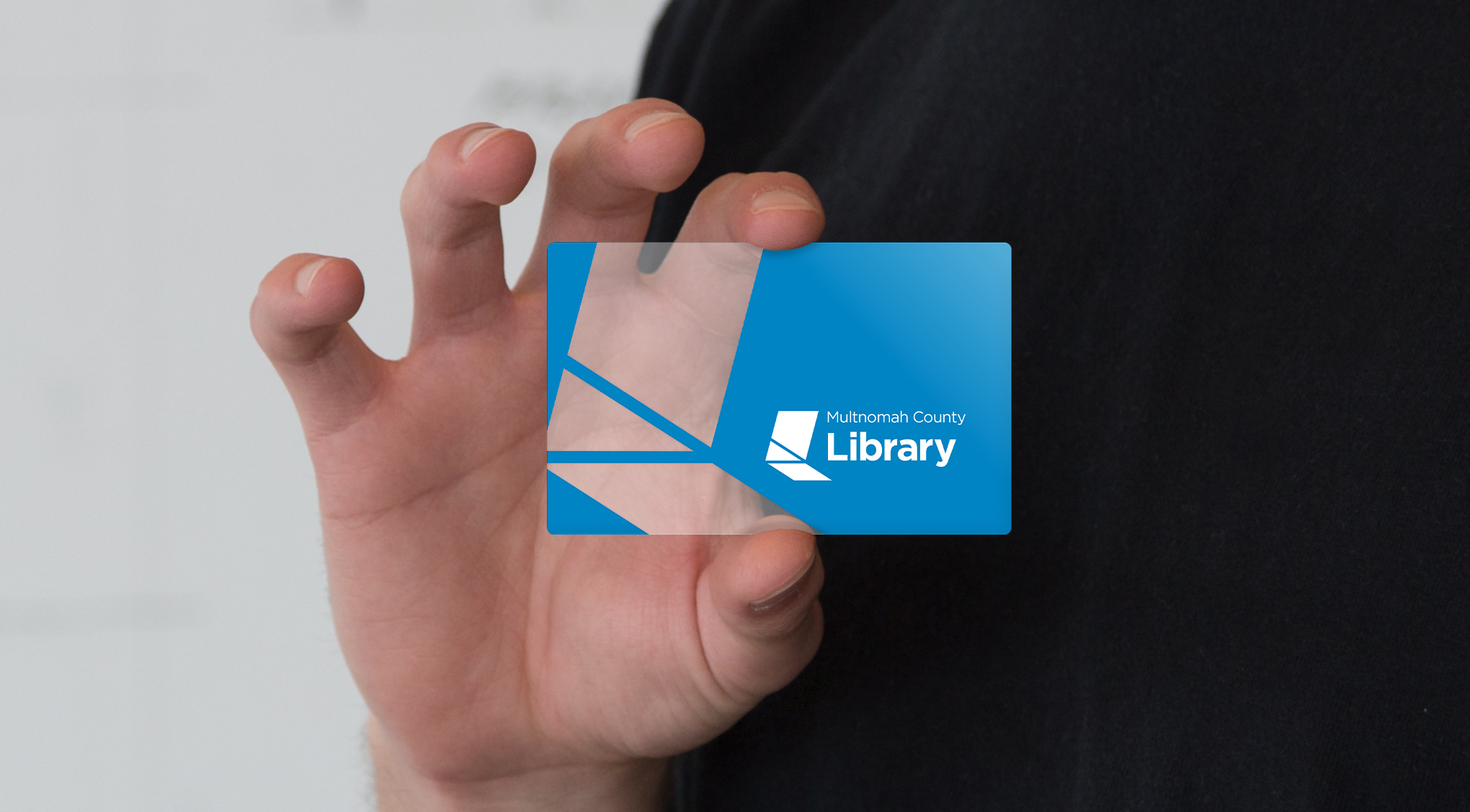
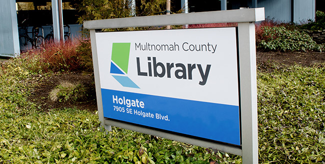
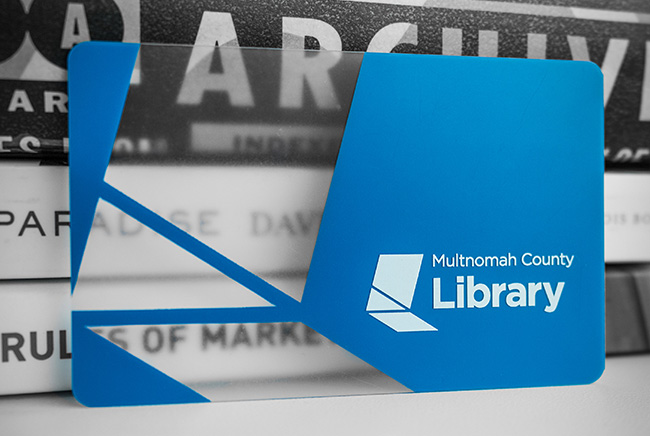
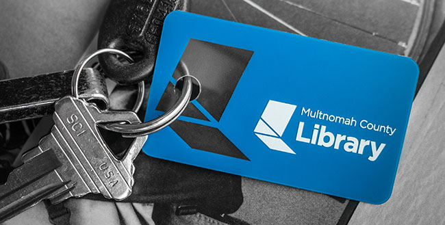
The new logo is a strong representation of possibilities. The “L mark” represents an open door. It can also be interpreted as a book or an “L” for library. The feelings from this mark provoke a feeling of open public space, welcoming and friendly, free, and progressive.

BRANDING

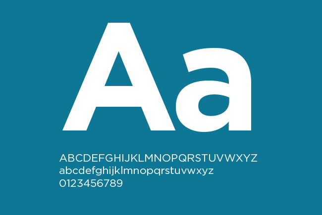
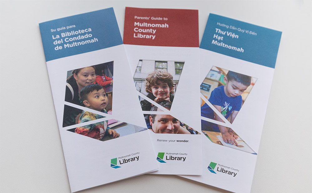
Here are a few examples from the branding guidelines including: colors, tagline, photography and treatments for the ‘L-mark’.

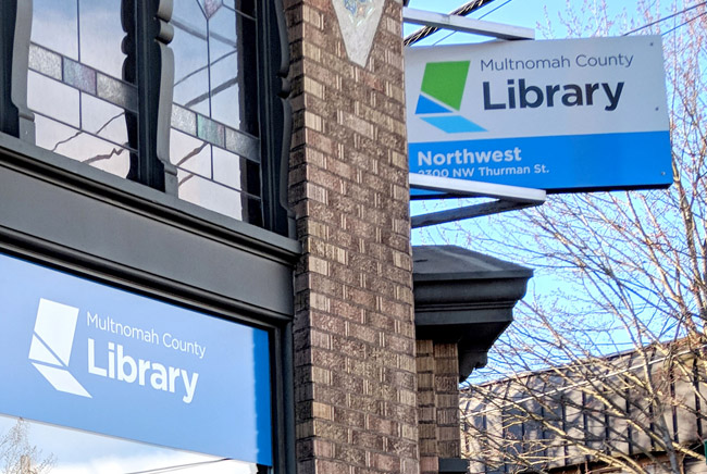
EXECUTIONS

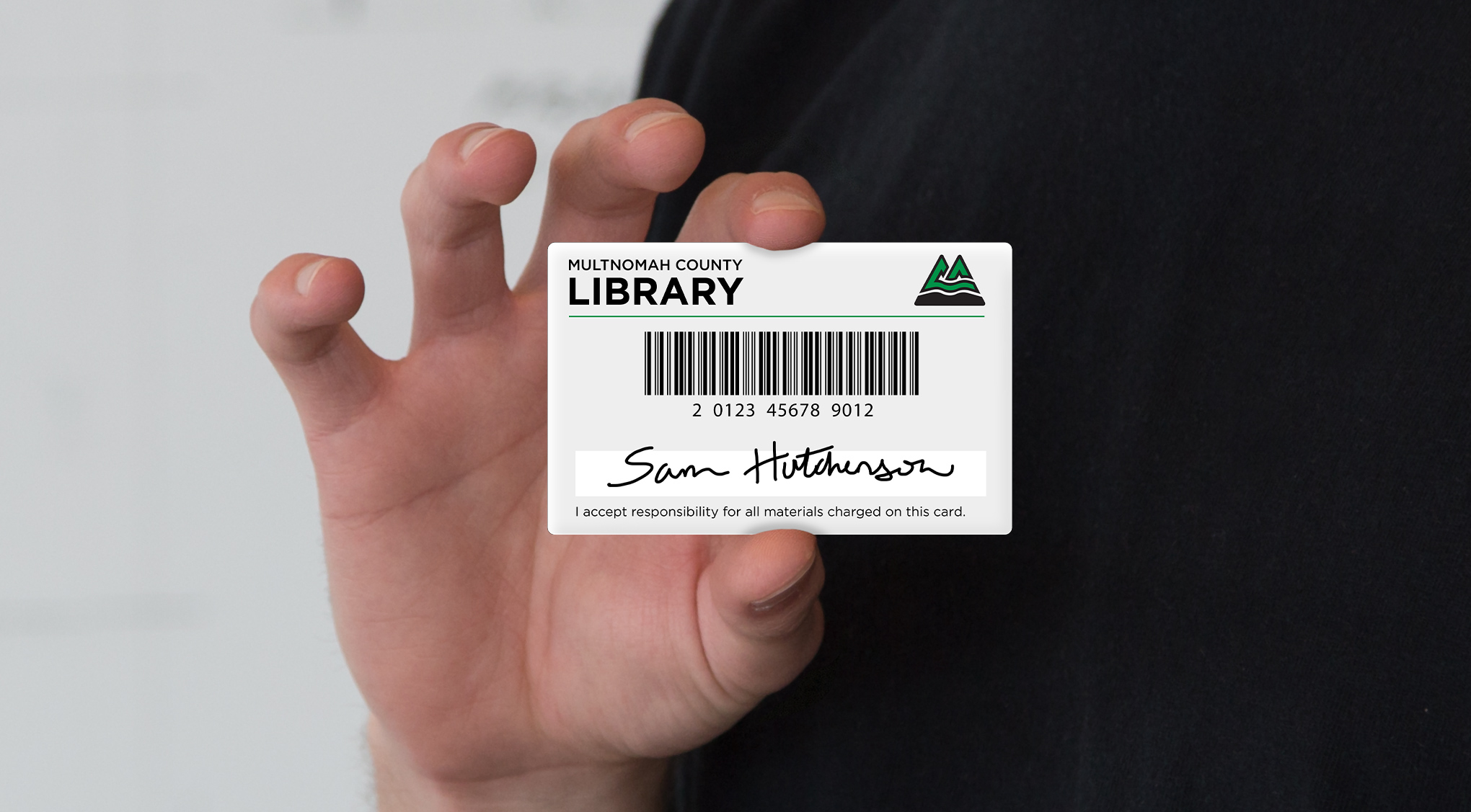
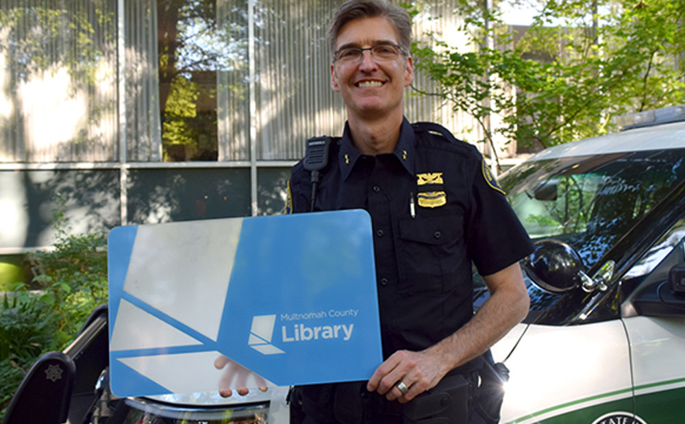
Once the logo and standards were completed and handed off to the Library, they moved forward with executing designs outlined in the branding guidelines book.