Oregon Department of Agriculture

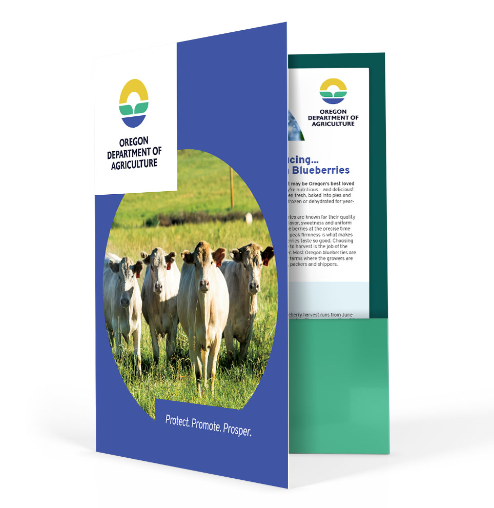
Promote. Protect. Prosper.

OREGON DEPARTMENT OF AGRICULTURE

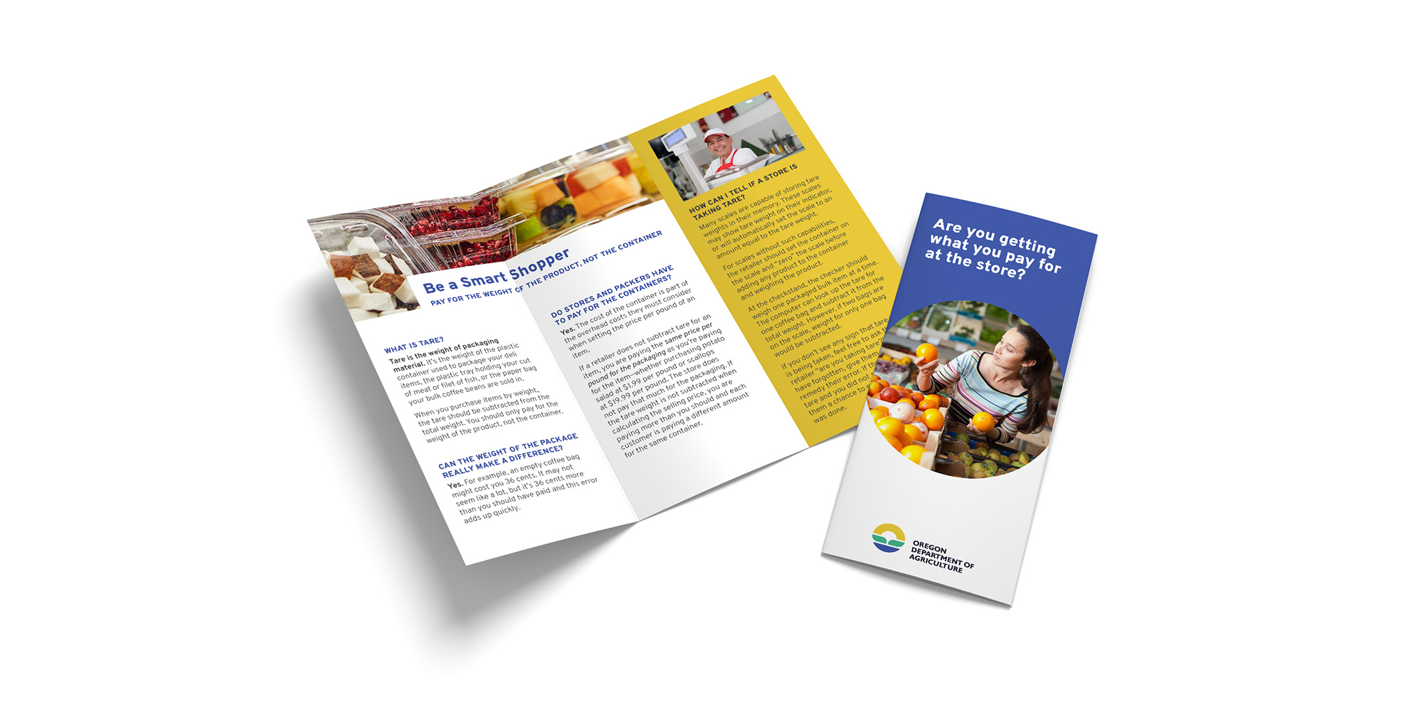
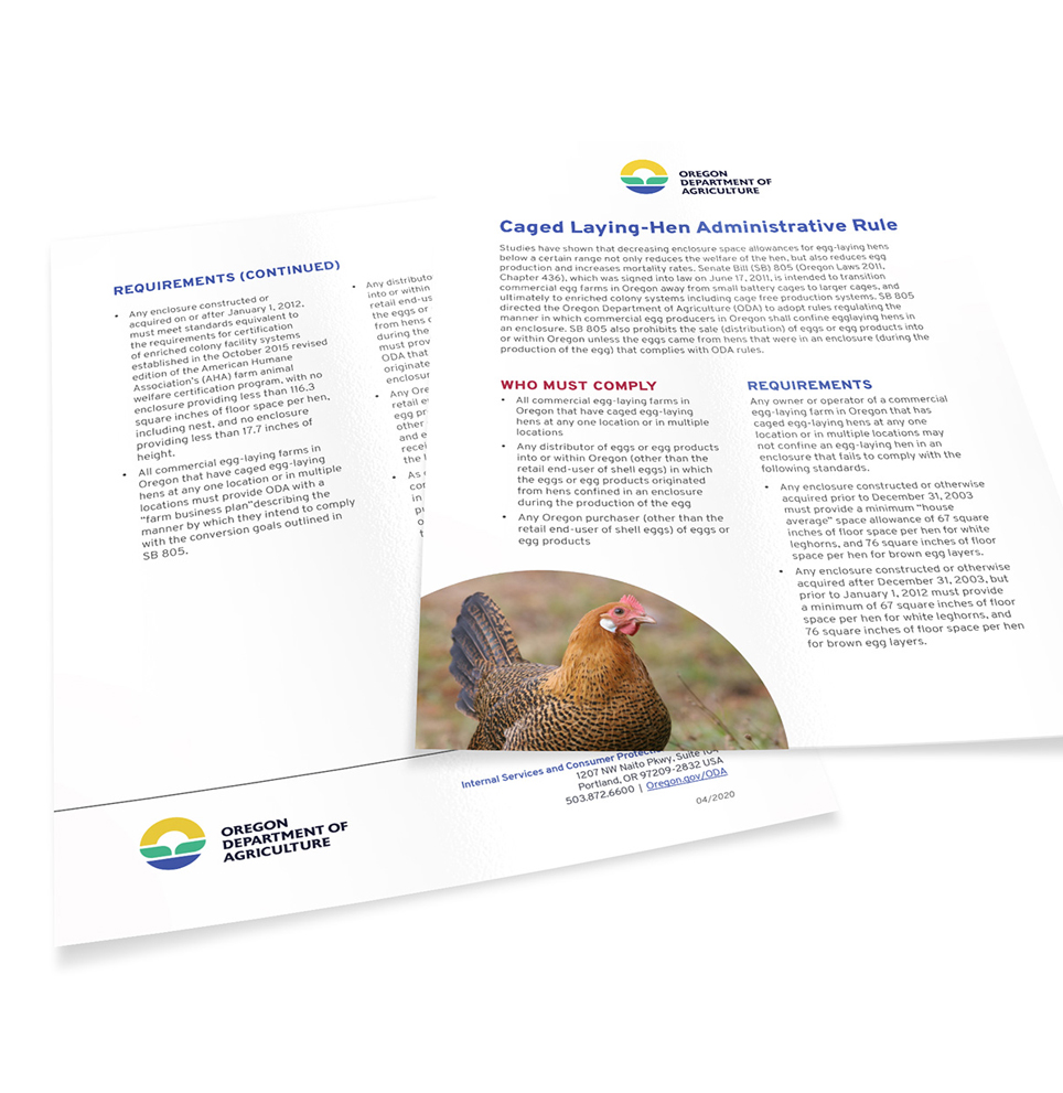
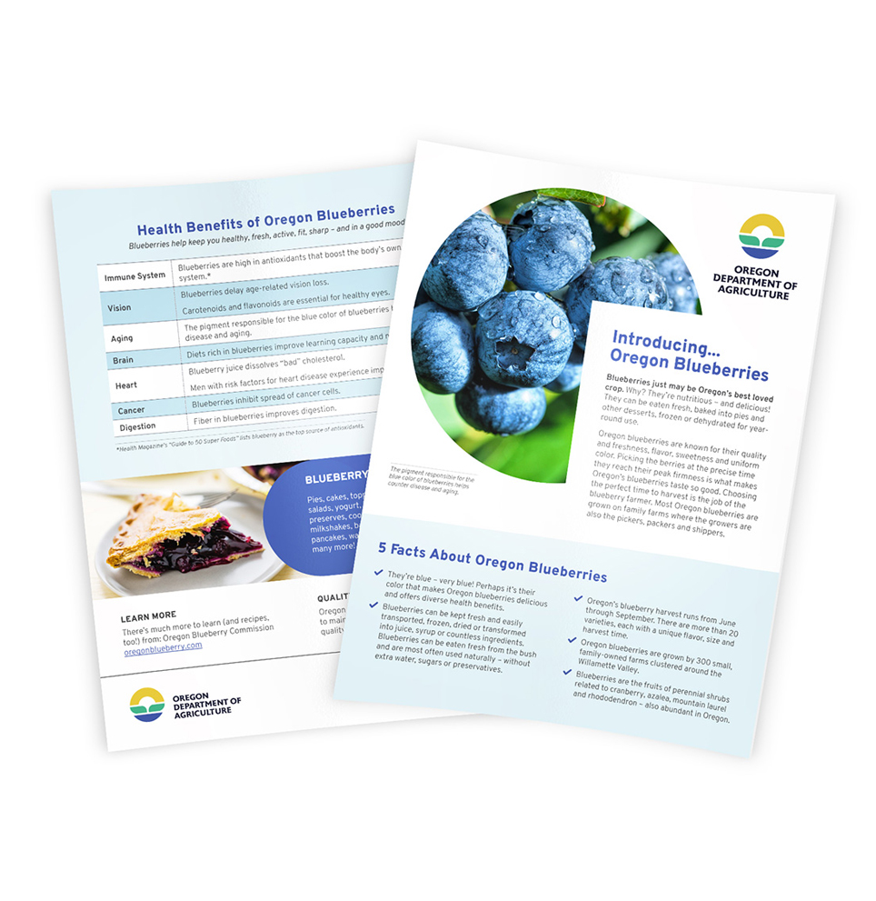
ODA is uniquely responsible for promoting as well as regulating Oregon’s agricultural products. They are a complex organization with many programs and offerings. Their old branding was split between many logos and styles as their main mark no longer represented them well as an organization. The challenge for a new identity was to create a mark that served in an official, regulatory manner as well as a promotional aspect. It also needed to better represent all areas of Oregon, ensuring that everyone involved, both inside and out, felt represented by the new brand.

I worked on the logo development and brand guidelines and took part in the manifesto and tagline ideation.
CLIENT: Oregon Department of Agriculture
INDUSTRY: Agriculture
SERVICES: Logo design, branding
DATES: 2019

LOGO

Oregon Department of Agriculture was in need of a mark that better represented all of their many services, including international agriculture promotion, regulation and inspection, eastern to western Oregon animals, plants and food, and land and water management. Over the years, they created new marks for subbrands and used both the state seal and the agriculture landscape mark to convey a particular message.

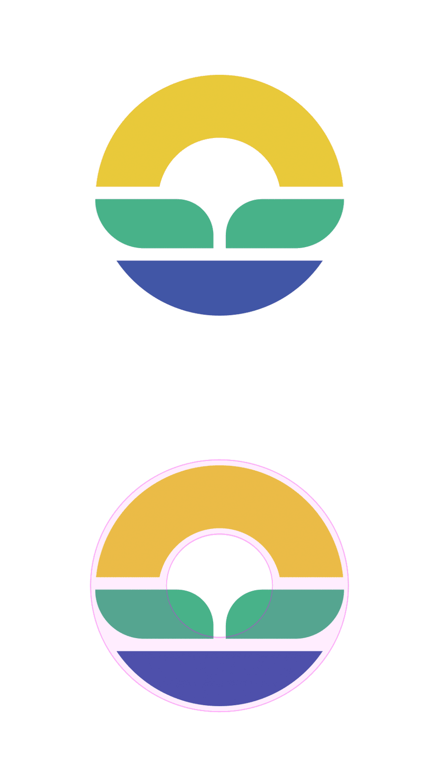
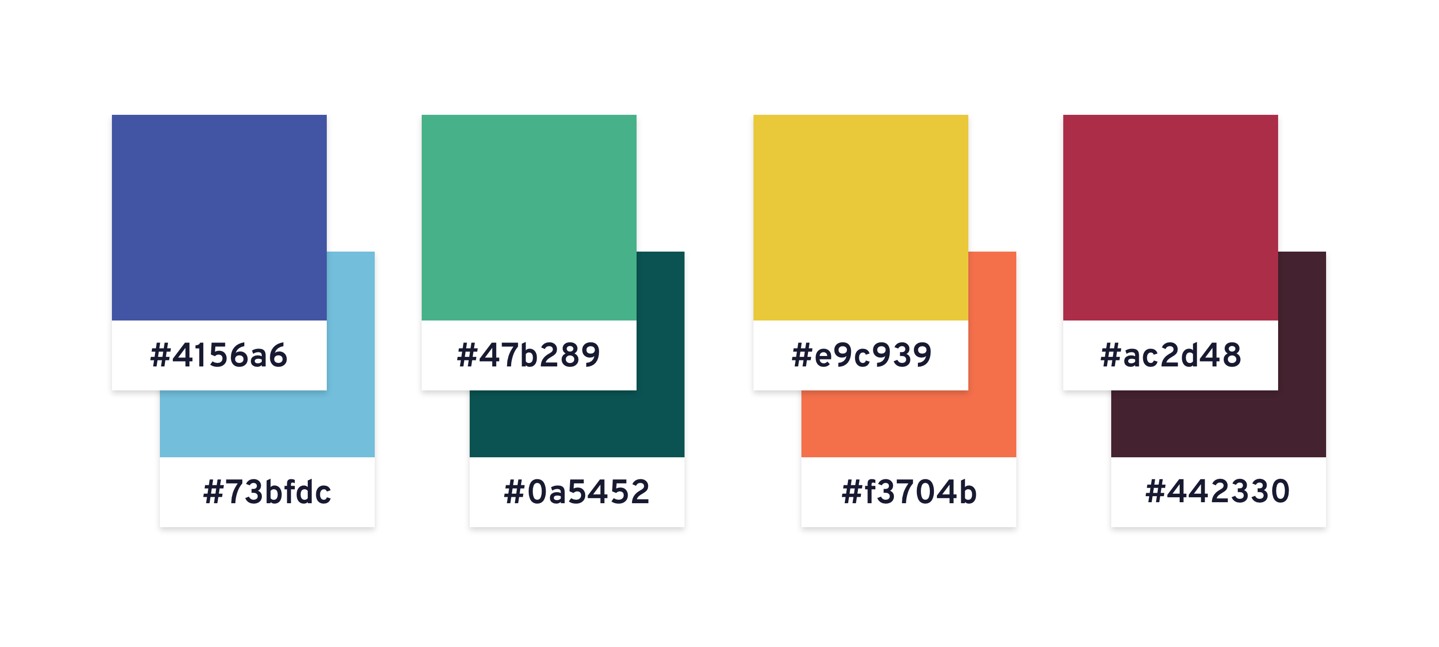
Blue represents: Oregon’s open waters, fishing, rivers, lakes, rain

Green represents: leaves, the fertile Willamette Valley, growth

Yellow represents: sun, eastern Oregon, fields of wheat

The final shape of the mark is an “O” for Oregon

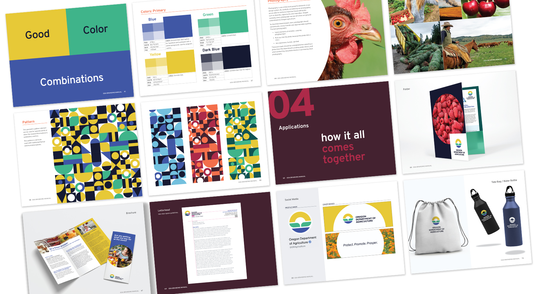
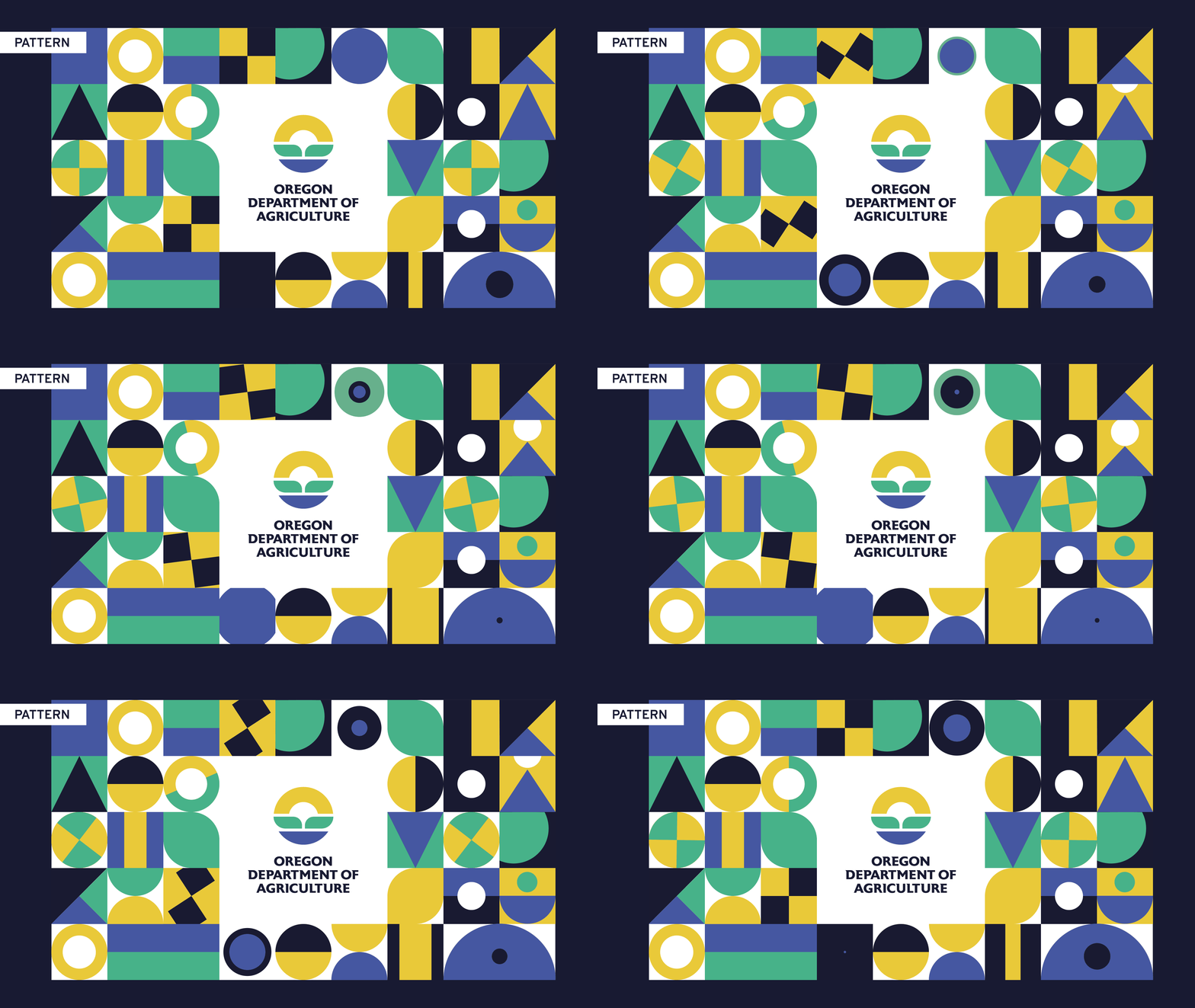
BRANDING